The April 2014 Challenge
Create an artistic rendering of the alphabet. This could be a display of a font that you create, but you needn’t limit yourself to something so utilitarian. The letters don’t need to be designed for legibility (though recognizability, at least in context, is desirable). The final result can be starkly simple or obsessively elaborate. The goal is to create a cohesive single illustration out of 26 discrete parts.
To be specific, your creation should consist of the twenty-six symbols representing each letter of the familiar Roman alphabet. The letters must appear in order, and in a single line. You can choose to use either capital letters or lowercase letters (but not both).
The Results
Brian Raiter


Ryan Finholm

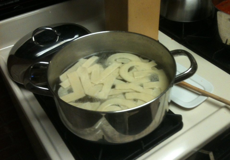
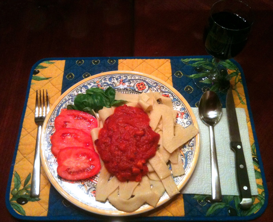
My alphabet is hand-made and hand-cut fresh pasta. I used a couple of small bowls to help me with some of the round letters (C, D, G, etc), but otherwise used no type of cookie cutter or stencil. The first picture is low-res due to the distance I had to get from the raw pasta (on wax paper, on the dining table) to take the photo, but I think the other two turned out okay. Andrei actually ate my submission, which may be a Commuter Challenge first.
Brian’s fourth submission is my favorite, it works really well. I think the only awkward letter is that P. I also like his fifth alphabet, which looks like some really nice calligraphy that melted a little.
by RyanF — 30 April 2014 @ 23:06
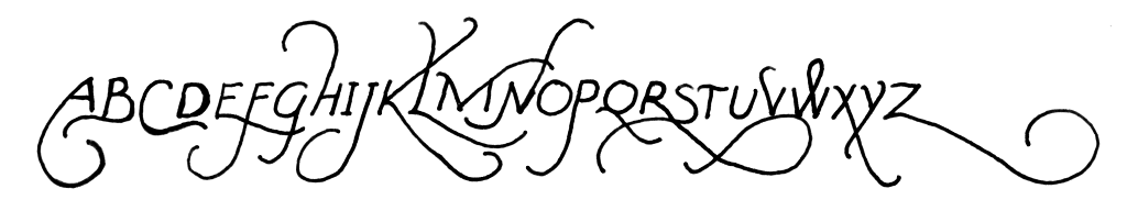
My first submission groups letters into pairs. Each pair uses the same shape for both letters (possibly rotated or reflected), except for the addition of a single straight line. Thus for example A and B are mirror images, with the extra line at the bottom of the B. The only exception is is at U V W X: U and V are perfect mirror images, so I gave their unused line to the W X pair, which I couldn’t make work otherwise.
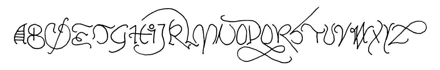
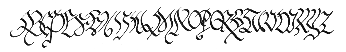
Submissions two and three are the sort of things that I doodle in meetings on a regular basis. The former is just a regular alphabet with excessive flair. The latter follows the pattern of trying to exaggerate one aspect of each letter, without actually ruining the letter’s design.
Submission number four uses an obvious constraint. This one is something I’ve done once before, decades ago. At some point I’ll have to try to dig up my original version and see if it looks anything like this one.
My final submission is closest to the sort of thing I had in mind when I proposed this challenge, the sort of thing where each letter is pushed to the limit of recognizability in service of the overall design aesthetic.
If I’d had time I would have done five more alphabets.
It’s always great when someone takes a challenge in a completely different direction from the obvious. Ryan’s submission is completely unexpected, definitely a Commuter Challenge first in several different ways, and simply lovely.
by Brian — 30 April 2014 @ 23:43