The August 2013 Challenge
For this month, it’s back to the drawing board, because this month’s challenge is to produce a diagram. What kind of diagram is up to you: it could be anything from an anatomical diagram to a scatter-plot, or even some kind of gussied-up infographic. The only constraint is that it has to have a mention, or some kind of link, to a mineral (or the field of mineralogy).
There are no requirements as to how the diagram is produced. If you’re looking for inspiration, check out informationisbeautiful.net, or search for “diagrams” on publicdomainreview.org, or for a different approach, google for “xkcd infographics”.
The Results
Ryan Finholm
Anniversary Gifts; Longevity vs. Value
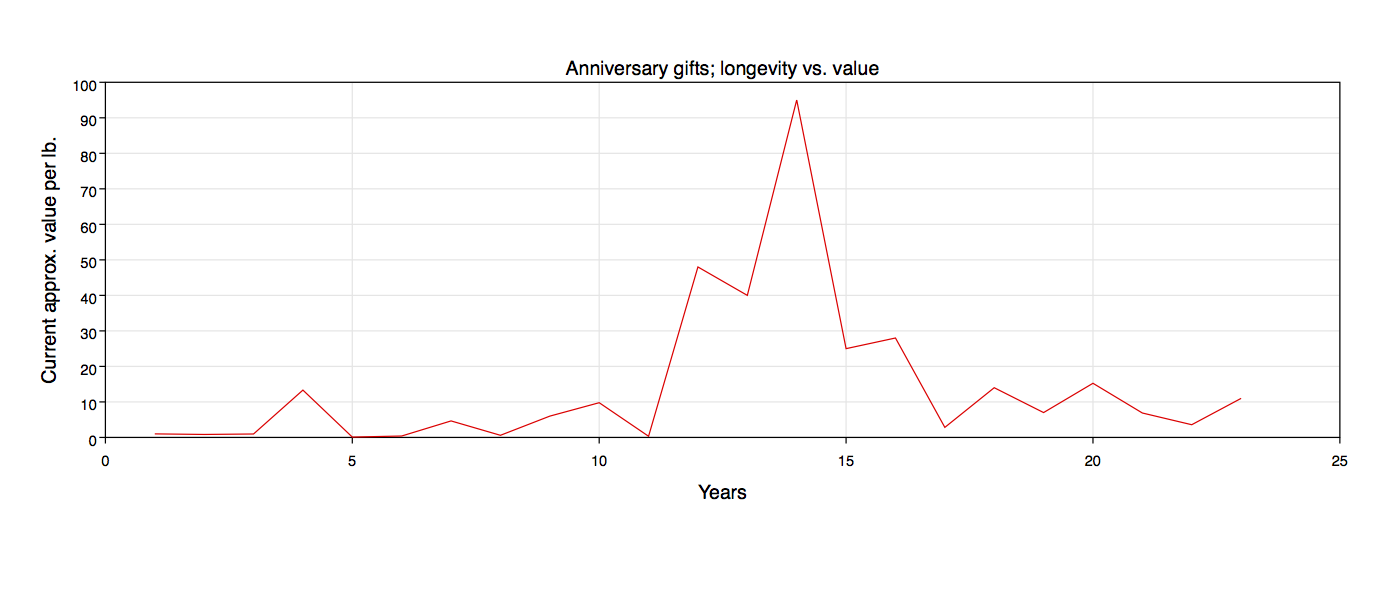
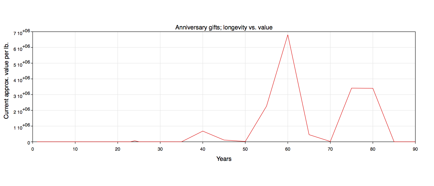
Caveat: The current ‘price per pound’ of each of these items varies wildly depending upon the type and form of the gift within that category. Obviously the typical paper gift would be books, or art, or stationery, instead of a ream of printer’s paper or an assortment retrieved from the recycle bin, and a one- pound diamond would be considerably more valuable than one pound of diamonds, but to make this graph as objective as possible I had to channel my inner Asperger and make some of my own arbitrary, unromantic, and often impractical editorial decisions. For example, for the 6th anniversary I used the current retail price of sheet iron ($0.40/lb) instead of scrap iron ($0.07/lb), and I ignored the fact that you can only get that price for sheet iron if you buy a ton or more at a time. For the gems, I based everything on the average cost of one pound of medium-quality one-carat gems. For Pottery, I found a place online that sells pottery by the pound. For Furniture I picked seven random, different pieces of new furniture (sofa, bed frame, dining set, etc) and divided their total cost by their aggregate weight.
I also used a conglomeration of the “traditional US”, “traditional UK”, and “modern US” anniversary gift categories as listed in Wikipedia in order to retain continuity and avoid repeat entries. For example, I chose Wool for the 7th anniversary in order to avoid repeating the Copper anniversary at year 22, and also so I wouldn’t have to approximate the per-pound value of pen and pencil sets. I chose Salt for the 8th anniversary to avoid an assortment of repeat Linen, Lace, Silk and Bronze years.
Gift legend (Year – Category):
| 1 | – Paper |
| 2 | – Cotton |
| 3 | – Leather |
| 4 | – Linen |
| 5 | – Wood |
| 6 | – Iron |
| 7 | – Wool |
| 8 | – Salt |
| 9 | – Pottery |
| 10 | – Tin |
| 11 | – Steel |
| 12 | – Silk |
| 13 | – Lace |
| 14 | – Ivory |
| 15 | – Crystal |
| 16 | – Silver Holloware |
| 17 | – Furniture |
| 18 | – Porcelain |
| 19 | – Bronze |
| 20 | – China |
| 21 | – Nickel |
| 22 | – Copper |
| 23 | – Silver Plate |
| 24 | – Opal |
| 25 | – Silver |
| 30 | – Pearl |
| 35 | – Jade |
| 40 | – Ruby |
| 45 | – Sapphire |
| 50 | – Gold |
| 55 | – Emerald |
| 60 | – Diamond |
| 65 | – Blue Sapphire |
| 70 | – Platinum |
| 75 | – Diamond and Gold |
| 80 | – Diamond and Pearl |
| 85 | – Moonstone |
| 90 | – Marble |
Brian Raiter
Power spectrum: the cosmic microwave background radiation temperature anisotropy
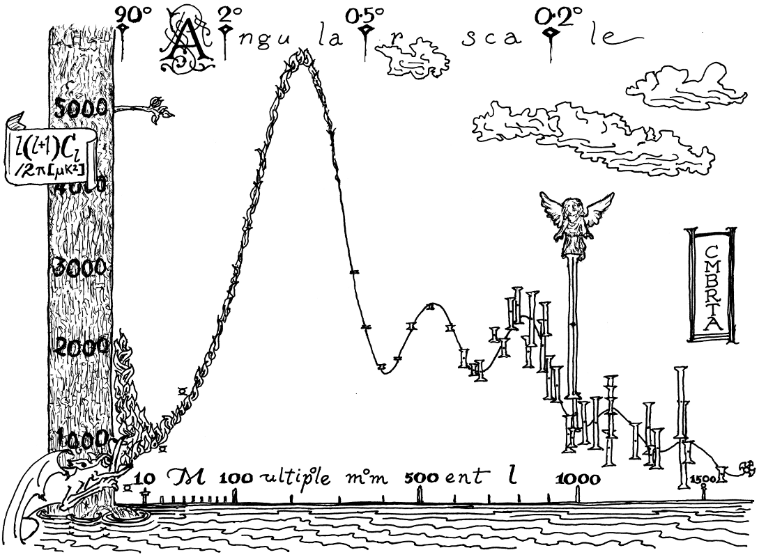
Scatter-plot diagram
The famous SF story “A Canticle for Leibowitz” describes a neo-Dark-Ages world in which, once again, monasteries have become the safeguarders of written knowledge, only this time around the monks are copying blueprints and schematics. With no understanding of what they are preserving, they begin to elaborate and decorate them in ways that are probably unhelpful, but seem appropriate to them. I imagined this process happening to the famous WMAP diagram — famous among astrophysicists, anyway. It shows the amount of “clumping” occurring in the early universe, as seen by minor fluctuations in the cosmic microwave background radiation, and how well the observed data conforms to theory. (Unfortunately the best data points are obscured by some monk’s fanciful decision to render the theoretical model as a gargoyle fire-breath.) I’m very pleased with how it turned out.
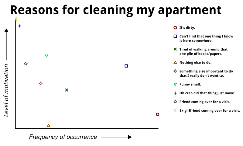
My second entry is the sort of thing that one occasionally sees on websites like graphjam, and it’s mainly just a bit of silliness. I hasten to point out that the graph is hyperbolic for the purposes of humor; it does not really describe me accurately! I’ve never had an ex-girlfriend visit me.
by Brian — 1 September 2013 @ 12:09
Ryan came closer to what I originally imagined was as spirit of the challenge when I first posed it. This is exactly the sort of unique perspective, bundled up into a single graph, that I could imagine being an xkcd cartoon. Or two graphs, in this case. Maybe the value axis should be a log scale? Ryan, get on that.
by Brian — 1 September 2013 @ 12:15
My concept has probably already been done elsewhere on the internet in one form or another, but I took some of Brian’s previous advice and avoided searching for it. Instead, I did all of the legwork myself (i.e. price research on the internet, average cost calculations where needed, etc), and much of that is described in the submission caveat text. I was hoping to see more interesting trends, but the outlier anniversaries (24, followed by 40, then 55 and 60) made all of the dollar values for the earlier years inconsequential and more or less visually indistinguishable from a flatline at $0. So I did two graphs, one for all of the initial and comparatively cheap anniversaries (1-23) and the other for the complete set (1-90). A log scale might have been more interesting, but the graph app I used for it wasn’t advanced enough for it and I was too lazy to do it manually on graph paper. I was hoping that more interesting trends might emerge, but the only “trend” was the semi-gradual (and inconsistent) spiky value increase leading up to the 60-year Diamond anniversary.
I would have preferred to do something more humorous and/or snarky like some of the simple-but-hilarious stuff on xkcd (like Brian’s second submission), but I couldn’t figure out how to do that while incorporating the extra ‘mineral’ constraint of the challenge. For a while I was thinking about doing multivitamin use compared to vitamin and mineral excretion in the urine of healthy adults with an average daily caloric intake and diet, but the figure “100%” doesn’t really constitute a diagram, and it would not be visually interesting nor particularly funny. Instead, I should have taken Brian’s more clever approach and simply ignored the constraint and done whatever I wanted.
Brian’s WMAP diagram is epic and beautiful, and I’m glad that he explained it in the comments section because I had no idea what it was until I read his comments. Then I read the Wikipedia on the WMAP diagram, and I still don’t understand it very well, but I recognize the graph and I think what he did with it is impressive. And his “Reasons” graph is hilarious, and exactly the sort of thing that I wanted to do instead of my anniversary year project.
by RyanF — 2 September 2013 @ 10:48
Unbelievably, I completely forgot about the mineralogy constraint until Ryan pointed it out to me. I say “unbelievably”, but in fact this is the second time I’ve done this. Fortunately we don’t grade our submissions, so instead of trying to come up with a crazed ex post facto tie-in to minerals, I can just say mea culpa. And make a mental note to be more careful in the future. If it happens a third time, that’s a pattern.
by Brian — 2 September 2013 @ 13:22