The February 2013 Challenge
Create a black-and-white illustration — not a grayscale drawing of various levels of shading, but an illustration consisting only of areas of solid black and solid white. Use ink, paint, or whatever medium you’re comfortable with. (And although you should be drawing by hand, you are free to use software to, for example, increase the contrast so as to remove gray-valued areas.)
The only other requirement is that your drawing’s space should be, as well as you can reasonably manage it, equally divided between black and white areas.
The Results
Ryan Finholm
Brian Raiter
Laura Timares
Brian Timares

I did a bit of experimenting this month, which is how I wound up with three entries.
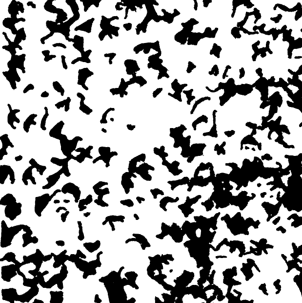
The first one is a fragment of a huge crowd scene. It was done with a regular ink pen. I had imagined that the result would look a lot more interesting than it turned out. A few spots are recognizable as faces, but the vast majority are just like a welter of arbitrary shapes. Trying to render the latter accurately was extremely time-consuming, and I quit after having drawn only a fraction of the original.
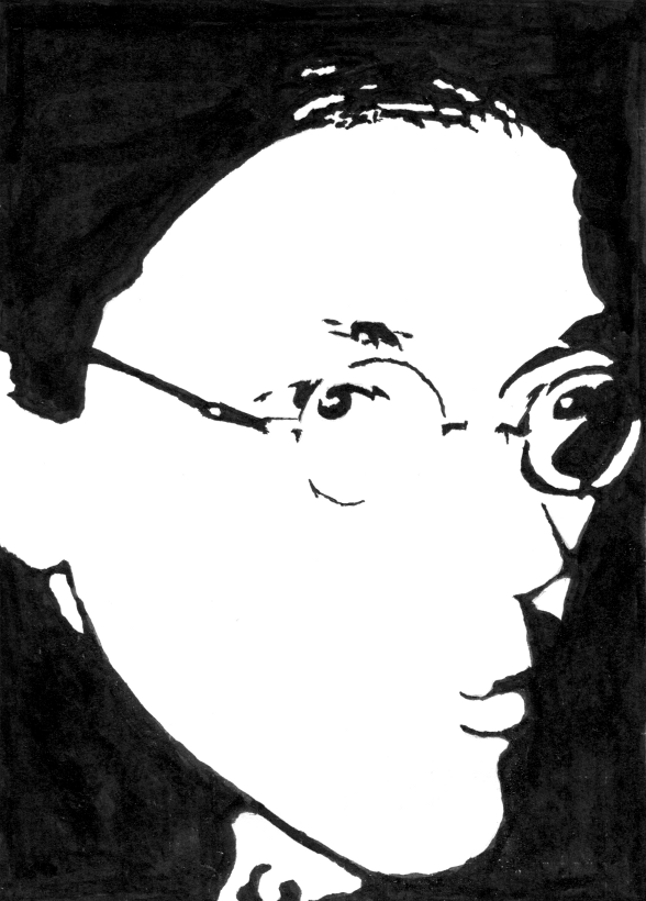
The second one is another self-portrait (in fact, it’s based on the same photo that I used for my submission last month), and was done with india ink and a sable brush. I love india ink.
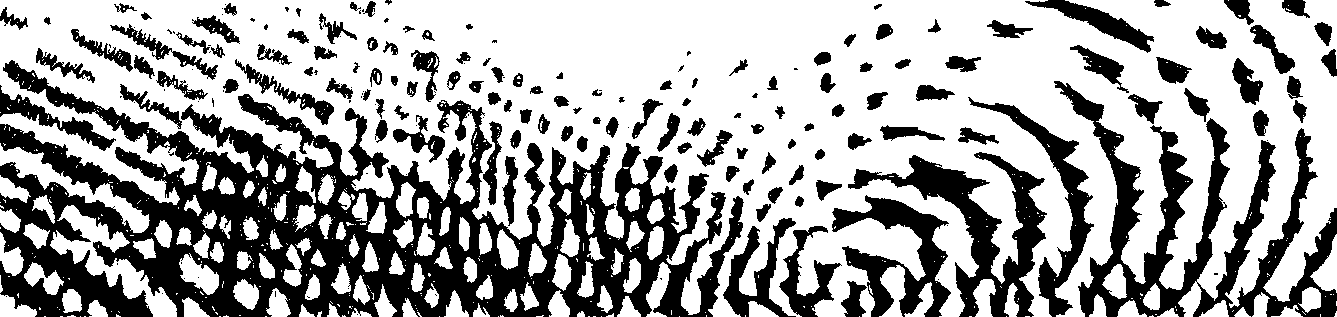
My third submission is an abstract pattern, mainly done because I felt strongly that this challenge cried out for an abstract pattern submission. It would have been better if I could have rendered it with the mathematical precision that it demanded, though. Like the first one, it proved exhausting to render in full, and I wound up doing a little less than half of the projected image before I had to quit. This one was done with a mechanical pencil.
All three of my entries were based on photographs. In each case I took a grayscale image and turned the contrast all the way up, trying out various brightness settings until I had a 50-50 mix of black and white pixels. Of course all of my drawn images drifted away from this perfect balance, but it helped to have that be the starting point.
For my first and last entry, I used the computer to turn the mostly-black-and-white scanned images into actual-monochrome-as-in-1-bit-per-pixel images. The middle one I left as a grayscale image, though, and you can see some parts where the ink is less solid than others.
by Brian — 28 February 2013 @ 22:11
My first thought was to make a bowl or plate at Painted-By-U which would have been fun, but there is a lag between painting and firing, and by the time I thought of it, it would be ready on March 2nd.
My second thought (this evening) was to do a woodcut since I like German Expressionist woodcuts. Clearly there wasn’t enough time.
My third thought was concrete poetry. Yessss.
I figured y’all commute on a train of some kind, so I did searches on ‘art deco train’ to help decide the basic shape. I laid it out and sketched it with a pencil. Then I inked the outline with one of my fountain pens, and filled in with another with a broader tip, then erased the pencil lines. If I do something like this again, I’ll find a marker or brush to do the filling in.
I photographed it and brought it into Lightroom to adjust the exposure and to crop it. I used GraphicConverter to change it to black & white and save as a GIF. Then I used ImageJ (with my wife’s help) to measure the areas of white and black (I’m about 48/52 with the current crop, close enough).
As you can see, my wife is far better at this sort of thing than I am. She also thinks my train is cute, but I explained that it is concrete poetry and is very manly and brimming with testosterone. It’s good to know I can still make her laugh.
by Brian Timares — 28 February 2013 @ 23:27
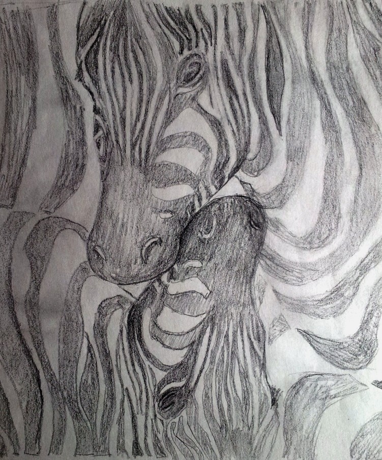
Midway through this month, after I’d already committed to doing the zebra, it struck me that Raiter must have proposed the February Challenge in order to try his hand at emulating a M.C. Escher pattern/tessellation/wallpaper group. So it was a surprise to see his more experimental submissions. FYI although that crowd scene stumped me completely, Andrei got it on his first guess (prior to Raiter posting the explanation).
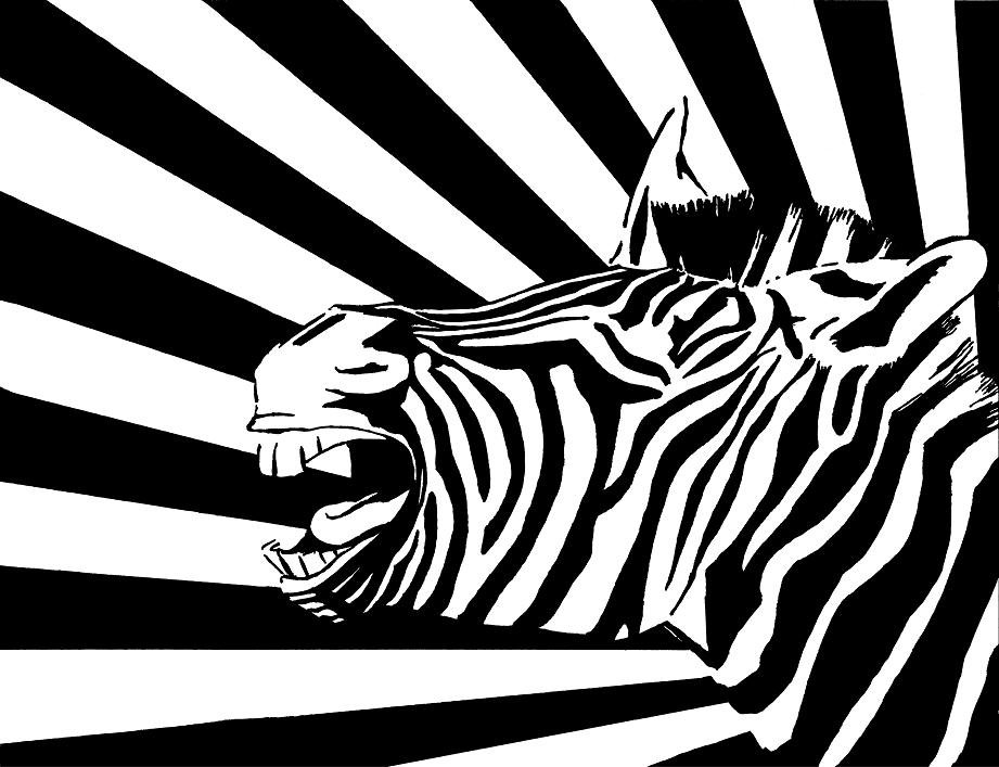
My first thought was to draw a group of chimpanzees. I’m not sure why. As I was perusing images online it struck me that a zebra would be more fitting for the challenge, but I’d already seen an image I liked of a screaming monkey head with those El Lissitzky lines emanating from it. I figured that a braying zebra head might come close to capturing that same feel, and the lines would bring the illustration closer to the challenge’s requirement of equal division. I made a few attempts at doing the drawing utterly freehand, but it looked too much like the Fruit Stripe zebra so I scrapped that and reverted to blocking the proportions out in squares like I do with most of my art projects. As soon as the proportions were set I did the rest freehand (except I used a straightedge for those lines). I used three different pens, including a Sharpie Magnum permanent marker (with a huge 5/8″ wide tip), an ultra fine point Sharpie, and a black gel pen for the edges. That Magnum came in really handy and saved me a lot of work. I scanned it as a black and white image and did a little digital cleanup of stray dust spots, but it is otherwise true to my drawing.
I strongly prefer Laura’s effort to mine. Even though we both did zebras, her work is more creative and more interesting. And it is more evocative of M. C. Escher than any of the other submissions. I also really like the facecard symmetry of the drawing. Really nice.
by RyanF — 1 March 2013 @ 00:40
For the record, since the issue has been brought up …
It looks like Brian Timares came the closest with a 48/52 ratio, followed closely by Ryan at 47/53, and just as closely Laura Timares’s zebras and my self-portrait come in at 46/54.
My other two entries, though, are around 35/65 — way too much white. (That’s a side effect of quitting early, before getting to the lower part where all the shadows are.)
by Brian — 1 March 2013 @ 00:48