The December 2009 Challenge
Create a dust jacket for one of your favorite books. No restriction on the kind of book (fiction, nonfiction, other) or the type of illustration, other than it be created by you.
The Results
Ryan Finholm

Brian Raiter
Create a dust jacket for one of your favorite books. No restriction on the kind of book (fiction, nonfiction, other) or the type of illustration, other than it be created by you.
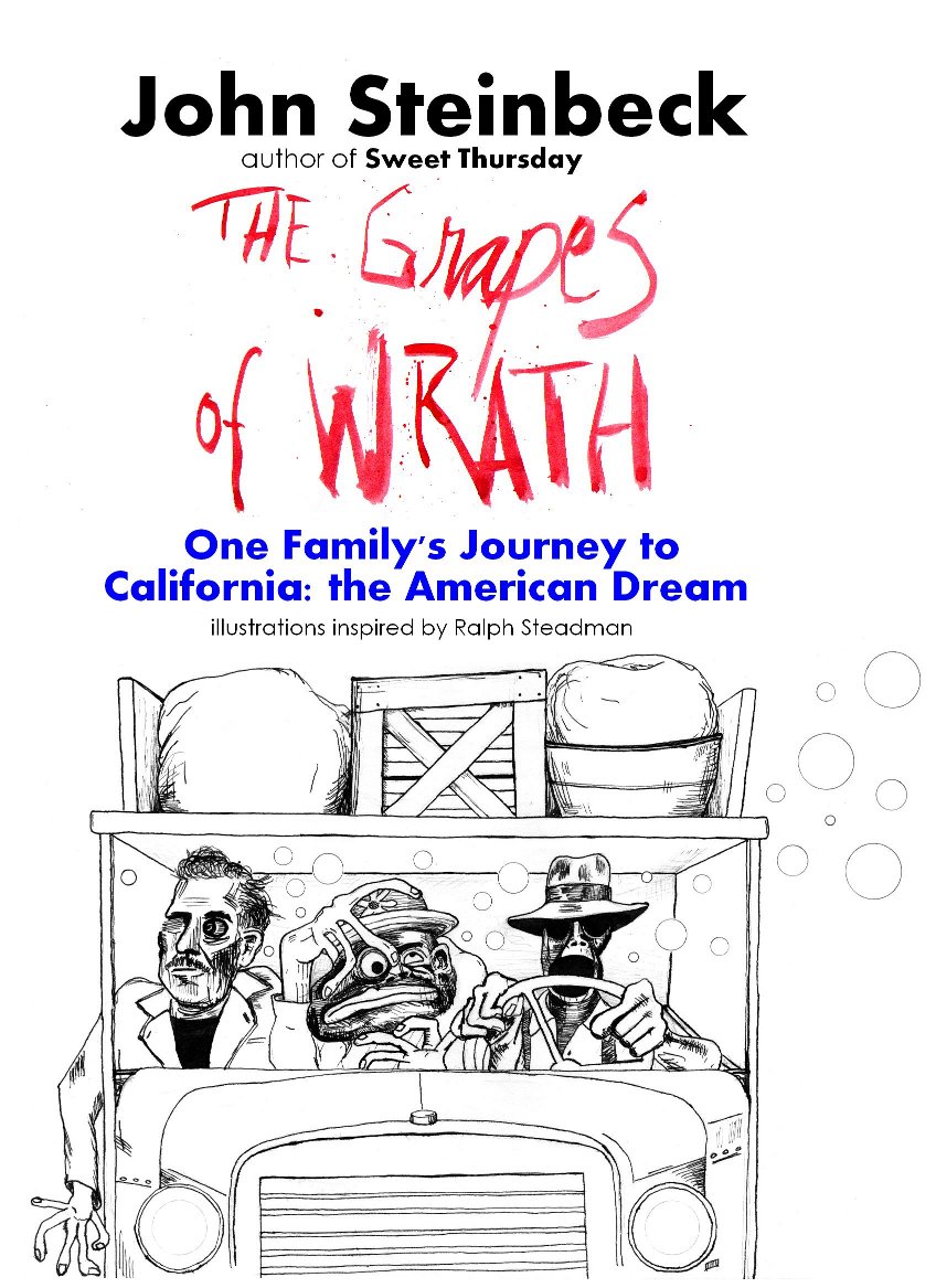
Okay, yes, so my submissions are pointedly unoriginal, and just for laffs, but they did take a lot of time and effort. They were all drawn completely by hand (except of course for the author and illustrator-related lettering for Wrath). The coloring for the Triffids was done on the computer, and that took a lot more time than anyone might think. The inking for the Triffids was done with a gel pen, but I used an olde-timey fountain pen and inkwell for all of Grapes.
The subject matter for each dust jacket was not random; they have specific associations. Of course the Giving Tree/Day of the Triffids both include sentient plants, capable of independent movement. The Grapes of Wrath and Fear and Loathing in Los Vegas are each consummate American road novels. I love Silverstein (though Giving Tree isn’t my favorite of his works), aspects of the Day of the Triffids terrified me as a child, I found The Grapes of Wrath quite powerful when I read it, like, 25 years ago, and of course I have a soft spot in my head for Fear and Loathing.
I’d like to point out a couple of details: The triffid for the first illustration was specifically based on John Wyndham’s own personal drawings of how he imagined/described the triffids in his novel. And as for The Grapes of Wrath; I picked what I figured might be one of Steinbeck’s least-known novels for the ‘author of’ bit, I changed (or added) hats to the Gonzo and Duke figures to better fit with the Grapes characters, I changed the car to a truck to be more consistent with Grapes, and I added my caricature of Steinbeck to accompany Gonzo and Duke. I wish I could have made the Steinbeck caricature more Steadmanesque, but I wanted him to be very recognizable as Steinbeck, and I doubt that I could succeed in that while subjecting him to the kinds of convolutions that the Gonzo and Duke faces received at the hands of the brilliant Ralph Steadman. I also need to admit that I never got around to adding the horizon, cacti and skull to the landscape around the truck. I figure I’ll do it later (just in case anyone was upset that I had omitted those details). (As if anyone other than Breadbox is reading any of this.)
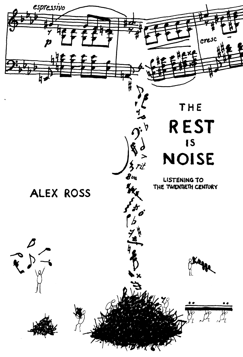
And speaking of that devil, I found Brian’s submission original and delightful, and a vast improvement over the actual dust jackets that I’ve seen for The Rest is Noise. No offense to the artistic director at Mr. Ross’s publisher, I mean I do love that wild font for the black cover of the British edition, but the American editions are as dull as one can get, and neither version has any type of illustration. Brian’s take on it is playful and inventive, and much more appealing.
by RyanF — 4 January 2010 @ 22:05
“The Rest is Noise” was the most recent book I had completed in early December, so it was already a natural choice for me. On top of that, I also love music notation, and have been known to doodle music notation when bored. So the idea for this came pretty early in the month. I like it because it suggests how early 20th century composers tried to anticipate future trends by extrapolating from current ones, and also how later composers tried to clear away the decorative layers and return to the basics.
The musical excerpt at the top is from a Chopin piano prelude. Unfortunately, I had already started drawing when I remembered how much I hate drawing sharp accidentals. (I have such a hard time getting them to come out looking right. They always come out too fat.) As for the little figures — the top left one is John Cage, making an aleatoric composition by throwing notes up in the air; at the top right is an unspecified composer meticulously building up a dissonant chord; the bottom left figure is Schoenberg, who is stockpiling the extra accidental signs that twelve-tone composition demands; and of course at bottom right the early minimalists are making off with a repeat sign.
A properly done book cover would have involved using a ruler for the staff and measure lines. And the note stems. And the beams. Sadly, I know from experience that doing that adds a lot of time and effort to the job, so as a result I put off getting started until near the end of the month, by which point there was no time. Ah, well.
by Brian — 5 January 2010 @ 02:39
Both of Ryan’s submissions are simply excellent. I love the basic concept, something which never occurred to me. And the execution of each is very nice. Everything about The Day of the Triffids cover is perfect, so much so that I initially guessed that Ryan had mostly done it on the computer, using the original illustrations as raw material. I’m quite happy to learn otherwise. And also quite happy that the second one was done with a fountain pen, as any Ralph Steadman homage should be.
by Brian — 5 January 2010 @ 02:52