The August 2008 Challenge
The website omniglot.com has a large catalog of examples of the many different forms that written language has taken throughout human history. Alphabets, abjads, syllabaries, ideographs, and as-yet-undeciphered writing systems all can be found there. There is also a subsection at this site devoted to constructed writing systems. The challenge for this month is to invent a writing system suitable for submission to the omniglot website.
Note that the challenge is to create a script suitable for submission, so it is not required that you actually submit it. But of course we hope that you ultimately will.
The Results
Sam Bleckley
Uncle Jard
I’ve developed a phonetic alphabet that I’m calling “Uncle Jard.” It is highly ambiguous; each character represents two sounds — logically related sounds (voiced/unvoiced consonants, long/short vowels) — but two apiece nonetheless. Diacritics can distinguish the sounds (a dot above each letter to distinguish between voiced and unvoiced), but diacritics take time to write, and speed was one of my criteria. At only 15 symbols, it is fast and fluid to write, and it looks pretty good, too.
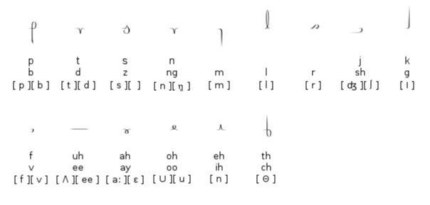
The characters are based off of simple manipulations of the line; all are single strokes, and all connect together on at least one side. Arabic was a major ispiration for this, as was the study that was chain-mailed around a few years ago — taht pinoted out if frist and lsat ltetrs of a wrod are sitll in palce, the wohle is sitll raedalbe.
So I wanted to remove as much redundancy as I could — and I almost went too far. I’ve been taking notes in Uncle Jard — and writing in it is becoming more and more fluid — but reading it is still a bit of a challange. As more shapes become familiar (like the shapes for “tion” and “and”, I think that the readability will improve. The learning curve is steep, though.
Sample text:
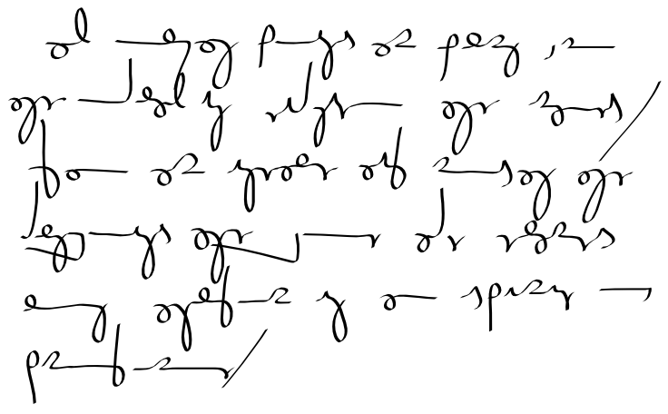
“All human beings are born free and equal in dignity and rights. They are endowed with reason and conscience and should act towards one another in a spirit of brotherhood.”
Adam Heck
Circumlex
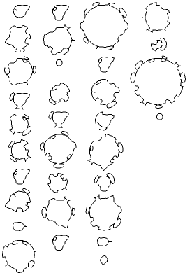
I decided I wanted a writing system that played with aesthetics and how words were laid out, rather than something usable. So in circumlex, each word is written in a circular orientation. The word starts at 12 o’clock and moves clockwise around the circle. Word radius is directly proportional to the size of the word. The flow of text is top to bottom, then left to right.
I designed the alphabet to allow words to resemble shapes moreso than a kind of cursive-in-a-circle as much as possible. There’s nothing fancy in construction of the alphabet; it’s a simple substitution for the English alphabet. The letters themselves are defined polarly, so the shape of characters tend to be distorted in short words, sometimes significantly. For example, in the first example, compare the ‘o’s in “of”, 4th column, second word, and “brotherhood”, 4th column, third word.
Sample texts:
“All human beings are born free and equal in dignity and rights. They are endowed with reason and conscience and should act towards one another in a spirit of brotherhood.”

“The quick brown fox jumps over the lazy dog.”
Brian Raiter
Constellation
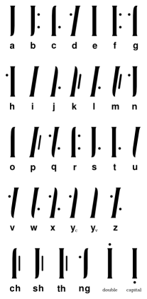
This is a straightforward alphabet called Constellation. The vowels consist of a single vertical stroke, and the consonants consist of a vertical stroke plus a dot, two dots, or a vertical bar. Note that the letter Y has two forms. The dotted form is used when Y functions as a consontant, and the dotless form is for the vowel Y.
Constellation writing takes the form of normal English spelling, with a few possible exceptions, as shown in the last line of the table. There are four glyphs to represent the common bigrams CH, SH, TH, and NG. Also, a doubled letter is written as a single letter with a dot above it. These are merely convenient abbreviations; spelling out bigrams as two separate letters would be unusual but not incorrect.
Finally, a capital letter can be indicated by a dot below the letter. However, there is no real concept of case in Constellation, and the dot is used only when it is strictly necessary to avoid ambiguity.
Sample text:
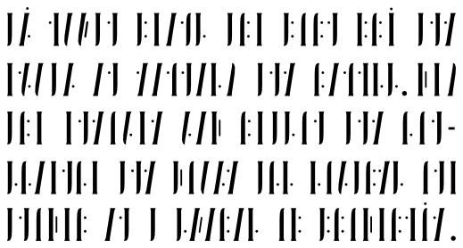
“All human beings are born free and equal in dignity and rights. They are endowed with reason and conscience and should act towards one another in a spirit of brotherhood.”
In case it isn’t obvious, my entry is sort of a joke. I originally started making something quite similar to Sam’s entry, except for being orthographic instead of phonetic. (I don’t like the idea of a purely phonetic script, since it seems to just cause problems with dialect variations.) Like Sam, I was trying to use extremely simple shapes that would be quick and easy to write, but since I had a full 26 symbols, I kept running into obstacles with keeping it unambiguous to read. After a while I found myself instead experimenting with seeing how far I could take ambiguity while still making it possible to read. Constellation is the obnoxious result.
(Originally I was going to give my script the unassuming name “Dots and Lines”. Then while I was working on it I found myself humming the line “Just a guy made of dots and lines” from the They Might Be Giants’s song “See the Constellation”.)
I had originally intended to also provide a handwritten sample, but I didn’t get it scanned in time. I did make a handwritten sample, though, and I found it difficult to avoid confusing the shapes for O and U (for example). Add that unintended ambiguity to the intended ambiguity of the double-dot characters, and I think I overdid it — even a hypothetical native writer of this script would have a hard time with it.
On the bright side, creating my images forced me to learn how to use Inkscape, a program that Sam recommended to me. For that alone this Commuter Challenge was worthwhile.
by Brian — 4 December 2008 @ 16:06