The March 2008 Challenge
The challenge is to create an ambigram.
An ambigram is a word or phrase that is written so that it can be read in more than one way. (Or, as Douglas Hofstadter put it, “a calligraphic design that manages to squeeze two different readings into the selfsame set of curves”.) There are many different kinds of ambigrams. The most common type of ambigram is a word or name written so that it appears the same when turned upside-down (or in technical terms, with 180-degree rotational symmetry). But there’s also ambigrams where the second reading is a mirror image, or the spaces between the letters of the first reading, or many other possibilities. Nor does the second reading need to be the same as the first; it can also be a related word (or name), or an opposite.
The two widely acknowledged masters of ambigrams are Scott Kim and John Langdon. They both have websites where you can view many examples of their creations. There are also several archives of other people’s ambigrams to be found on the web.
Feel free to create more than one if you get inspired. Or, create several and pick the most legible one for your submission.
The Results
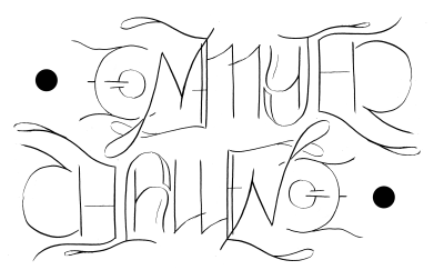
Sam Bleckley
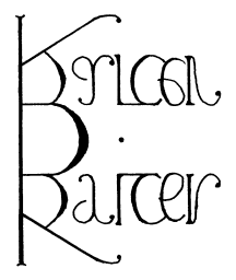
Brian Raiter


I love the l’ in Brian’s April fool’s Day; using the apostrophe as a stroke in the f is lovely. I’m also fond of the r which is an r upside-down. That’s a really tricky combination, and it was handled gracefully.
On mine, I placed the additional constraint that I wanted as few individual letters to be independent ambigrams as possible — so while C becomes E and O becomes G, it takes LLEN to become MM. I’m rather proud of that. Also, I did not want it to be immediately obvious that the text had rotational symmetry. I think I succeeded at that as well.
by Sam Bleckley — 31 March 2008 @ 20:12
I’ve often wanted to have an ambigram for my full name, so this challenge was an excuse to sit down and make one for myself. While the rotational ambigram is very popular, I’ve been oddly attracted to the symmetrical variety. So I tried that instead, and quickly hit upon the way to make the two capital letters work. Most of the rest of it followed quickly after that. The only real hard part was the A reflecting to TE. I spent a fair bit of time playing with the use of balls versus serifs (versus neither) to find the combinations that make the letters more readable. Not sure if it’s just me, but they seemed to make a big difference.
I came up with the idea for the April Fool’s Day ambigram during a meeting at work. Scott Kim used a similar sort of chunky-shapes font in one of his ambigrams (I’ve since forgotten which one), which impressed me for how flexible it allowed him to be with the letter forms. So I found myself leaning towards that, and it served me well. I was actually surprised at how well the letters cooperated with each other, leaving the double-o to fall naturally in the center. The RI to D was the only sticky part; I went through several ideas before I found the one I used.
by breadbox — 31 March 2008 @ 22:48
PS: My ambigrams were done completely by hand, as you can tell by close inspection. I wanted to use my scans as a guide for drawing the real ones on the computer, but I never got around to learning how to draw curves in the GIMP, so in the end I had to make do with these. For the first one, I drew the top half and traced it, then traced it again through the back of the paper. We had some good sunlight that day so I used my window as a makeshift light box.
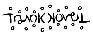
PPS: You folks are making me feel selfish. Here I am futzing around with my own name, and you folks made ambigrams for other people! I love the use of the bubbles in Ryan’s Trunk Novel; I completely failed to see that it was also part of the E at first. And Sam, your ambigram is wonderfully flowing and florid. It all works very well.
by breadbox — 31 March 2008 @ 22:59
I also intended to make a computer-trace of my design, and forgot. I would highly recommend using Inkscape rather than the GIMP. Inkscape does vector graphics much more easily; it also has some really wonderful kerning commands, when you’re dealing with actual text.
by Sam Bleckley — 1 April 2008 @ 07:27
I gotta admit, I spent the first half of the month trying to make an ambigram of ‘Commuter Challenge’ and completely failed. I didn’t think it could be done. I did two separate word ambigrams, one for ‘commuter’ and the other for ‘challenge’, but they were both shoddy, and of course if you strung them together it would have read ‘Commuter Challenge’ one way and ‘Challenge Commuter’ the other. I was floored when I saw Sam’s submission. Impressive, beautiful, clear and utterly cogent.
And of course Brian has always had a talent for lettering, so it’s not particularly surprising that he exceeded my high expectations for his submissions. I keep looking at April Fool’s Day, thinking ‘How did he DO that?’ The “ri” is really clever. I feel outclassed by both Sam and Brian. Again.
I thought that it would be easier for me to make a prettier ambigram after my recent jaunt into calligraphy with the illuminated page – the gothic script I used was really centered on reducing almost every letter down to one to three thick, vertical lines, which were then differentiated by adding little connecting lines and flourishes. It seemed like a great ambigram environment to work within, but I didn’t have any luck actually applying it to any of several words or phrases I tried it on. But checking out some ambigram sites on the web, it looks like I didn’t try hard enough, because many, many ambigrams take advantage of that same font style.
For those of us not in the know (i.e. everyone on the planet except me, Don and Brian), my ambigrams are the titles of the three completed Lonowrimo 2005 novels (http://www.muppetlabs.com/lonowrimo/): Brian Raiter’s “Trunk Novel”, Don Coffin’s “Untitled”, and my “A Note On The Type”. It’s a shame that the prettiest ambigram was for the lamest title. I also originally thought I’d just submit the ‘Trunk’ half of the Trunk Novel ambigram, but then I guess if you wanted to see ‘Novel’ you’d have to turn your monitor upside down, and I wouldn’t want to put you through all that trouble.
by RyanF — 1 April 2008 @ 08:43