The February 2008 Challenge
Illuminate a page. The text can be anything you want. You can do something traditional (i.e. a passage from a religious book), or maybe one of your favorite quotes, or something that you wrote yourself.
For more information on illuminated manuscripts, see http://en.wikipedia.org/wiki/Illumination_%28manuscript%29 or http://www.leavesofgold.org/. Gold leaf is not required.
The Results
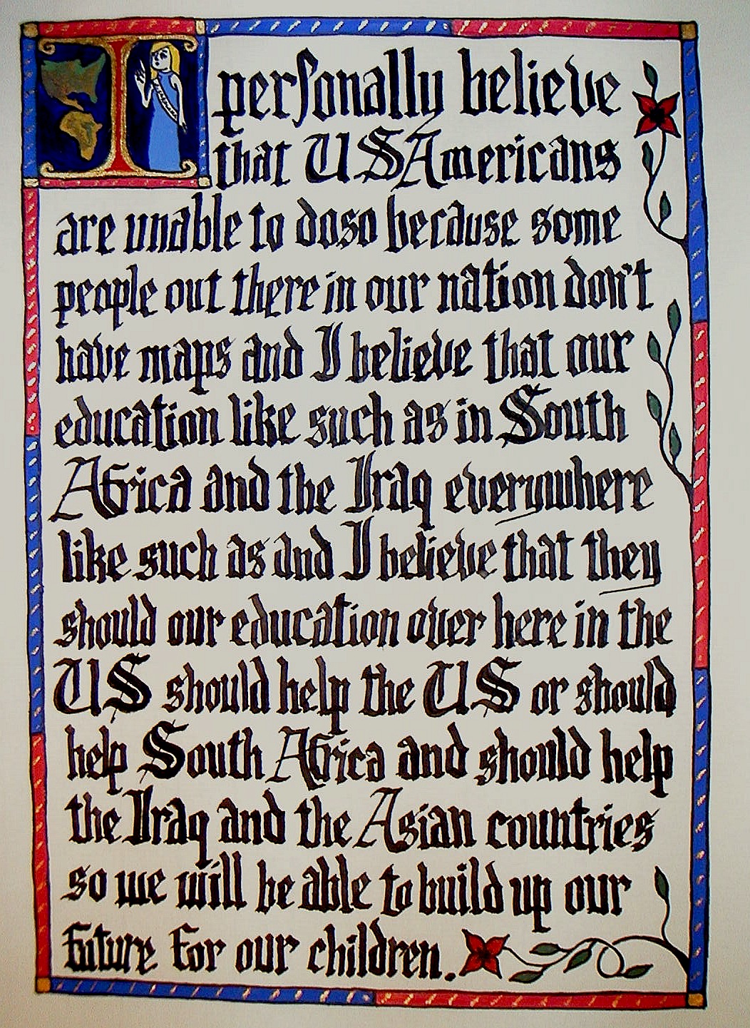
Ryan Finholm
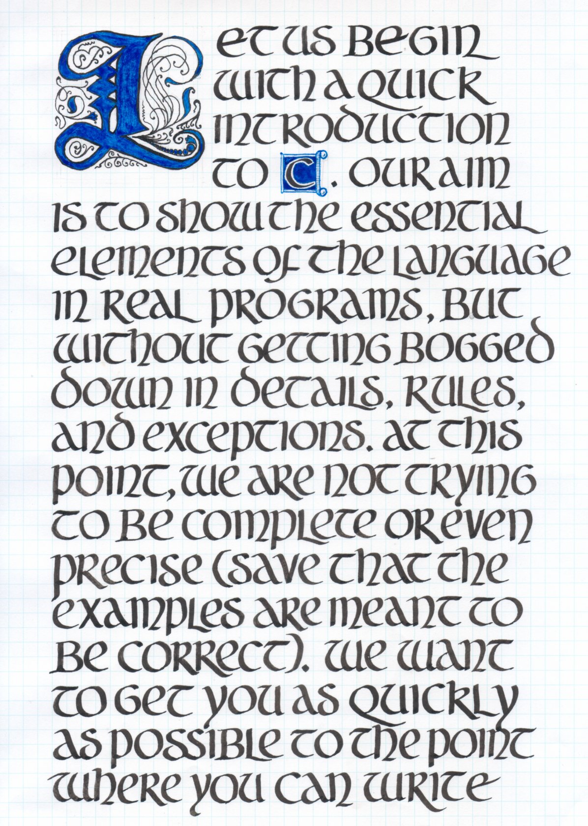
Brian Raiter
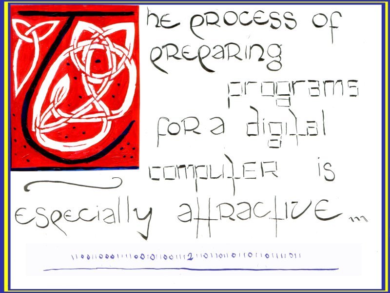
Sam Bleckley
The only reason I didn’t do something from “What Every Computer Scientist Should Know About Floating Point Arithmetic” is because I assumed Brian was going to do it. Instead he chose the first lines from what, The C Programming Language? Oh well, fair enough. Sweet lettering, and that initial “L” is fabulous.
I’d just like to clarify that I chose my subject out of misanthropy and NOT misogyny.
by RyanF — 1 March 2008 @ 13:21
Yes, “The C Programming Language” by Brian Kernighan and Dennis Ritchie (known universally as “K&R”). Generally considered to be one of the best programming language books ever written. That and Knuth’s books are probably the best candidates for religious texts for computer programmers.
I chose to go with a single blue color for the illumination to match the color scheme of the actual book’s cover. The initial letter is gothic in style, which is probably a bit anachronistic with the rest of the lettering, which is uncial in style. At first I was just doing a sample run on graph paper to get an idea of the overall layout, but I was so pleased with how it looked that I decided to use it as the final version. Graph paper doesn’t look as nice (and it didn’t take the ink as readily), but it saved me the tedious chore of having to draw and erase all the guidelines.
K&R was actually my second choice for the text, but my initial idea proved to be too involved to finish in time. I may try to do it later on (yeah, in my copious free time).
I wish I had been more inspired to design an illustration and borders, like Ryan did. They really give the page the feeling of being illuminated.
by breadbox — 1 March 2008 @ 14:57
Of course, if K&R are there, then Knuth must be too. Mine is the start of volume one of The Art of Computer Programming.
Unfortunately, it’s also a bit of a mess. I waffled on whether I should illuminate a new text in an old style, or an old text in a modern style. All that waffling equated to procrastinating, and so the actual final choice of text, layout, and painting happened in just a few days. I have a unclear, nonrhythmic, purposeless lettering that is just anathema to the typographer in me. Yuck. At least we have another letterform-based challenge so I can redeem myself.
Congrats to Brian. Your font is simply lovely, I can see how much time and thought went into it. I particularly like the kerning after the *l*s. My eye scans that whole page smoothly and the white and black balance wonderfully — it’s everything mine isn’t ;). All that jumps out are the parenthesis, which I imagine were a tough choice because they simply don’t belong the the period of the format.
And to Ryan: you’ve captured the human feel better than any of us, the texture of handwritten letters on the page; and you’ve matched those wavering letters to the text of a wavering speech. Go go gadget medium-message-mixer. You made a lot of great choices. I wouldn’t be the least surprised to see it in hanging in a gallery.
by Sam Bleckley — 1 March 2008 @ 22:00
A friend just showed me this etsy shop:
http://www.etsy.com/shop.php?user_id=37584§ion_id=5216055
The mind reels with the possibilities.
by breadbox — 24 March 2008 @ 03:19