The October 2007 Challenge
Create an illustration to a scary story. As usual, you can use ink, oils, photography, pencil, crayon, Photoshop, needlepoint, ASCII-graphics … whatever medium works best for you. A realistic style is not required, but try to avoid the purely abstract. The idea is for the illustration to be recognizable, at least to someone familiar with the story.
You can use any story you like as the source for your illustration. Include with your illustration a pointer to the story, and the specific scene you’ve chosen to illustrate. For well-known, freely available stories (e.g. something from Poe or Lovecraft) you can simply supply a sentence from the story as a caption, as was commonly done in full-page illustrations in 19th-century books. For stories less widely familiar, please include a short excerpt from the story that your illustration should accompany, so that we may appreciate your artwork in context.
The Results
Brian Raiter
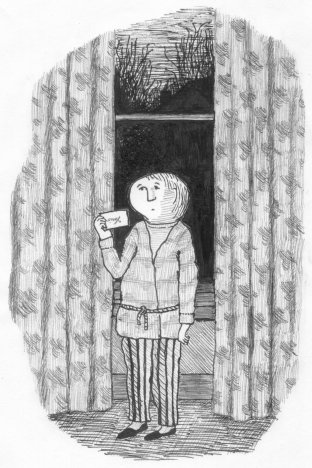
From The Figure in the Shadows, by John Bellairs:
 Lewis sat there wondering for a few minutes. Then he got out of bed, put on his slippers and bathrobe, and padded downstairs to the front hall. There on the floor, just below the mail slot, lay a postcard.
Lewis picked the card up and carried it over to the hall window. The gray light of a full moon was streaming in. It was bright enough to read by—but there was nothing to read. The card was blank.
Lewis began to feel creepy. What kind of a message was this? He turned the card over, and was relieved to find that the card was stamped and addressed. But the stamp looked very old-fashioned, and the postmark was so blurred that Lewis couldn’t tell where the card had been mailed from. The card was addressed in a neat, curlicued hand.
There was no return address.
Lewis stood there in the moonlight with the card in his hand.
Ryan Finholm
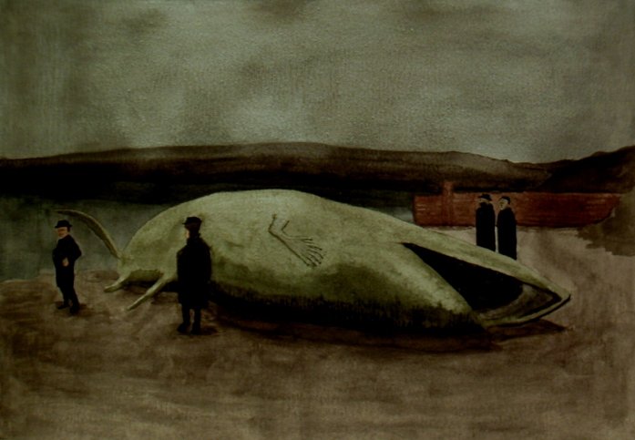
From The Horror at Martin’s Beach, by H. P. Lovecraft:

On May 17 the crew of the fishing smack Alma of Gloucester, under Capt. James P. Orne, killed, after a battle of nearly forty hours, a marine monster whose size and aspect produced the greatest possible stir in scientific circles and caused certain Boston naturalists to take every precaution for its taxidermic preservation.
What I love most about Edward Gorey’s illustrations is his shading and background patterns. A lot of Gorey’s work has several different intricate background shading patterns per drawing – the drapes, the different pieces of furniture, the wallpaper, the wallpaper you can see in an adjoining room through an open doorway, the rug, the wood of the wainscotting, and then the meadow, vegetation and sky outside the windows, etc etc etc. And Brian nailed it here. A berzillion little lines, all carefully arranged to make that impressive homage to the recently deceased Gorey.
The main effect I was going for was ‘sepia’ in my entry, but it didn’t turn out exactly as I’d hoped. Also, I didn’t realize until after I’d submitted that I’d forgotten to paint the gills on the monster (the gills are mentioned in the HPL story). I had sketched them in, but then was so intent on trying to get the hand/fin just right that I totally spaced out after covering the sketched gills with paint. As a disappointing postscript, after submitting this I tried to make some ‘corrections’ to the shading, the dock/wall in the background, and the sand/dirt in the foreground, and in so doing I effectively ruined the original painting. Watercolors can be unforgiving that way.
by RyanF — 15 February 2008 @ 09:40
The idea for this came from my friend Mike. He and I both greatly enjoyed reading John Bellairs’ “The House with a Clock in its Walls” when we were kids, and so we both naturally read the sequel “The Figure in the Shadows”, which is also quite good but has some amazingly creepy moments. (I remember thinking at the time that if the adults knew about this book they would probably take it out of the kid’s library.) I’m not the kind of person who likes being scared, but the Bellairs books are so much fun that I forgave him. Now, Edward Gorey illustrated the first book, and they are great illustrations. But the second book was illustrated by Mercer Mayer. They are excellent illustrations, mind you, with dense layers of shading appropriate to the scary content. But they are jarring after having Gorey’s faint and thin-lined characters fixed in mind. So Mike naturally suggested that I should do a Gorey-style illustration for the second book.
It was actually not that hard to do, as it’s mainly just a combination of elements from the first book’s illustrations. Also, Gorey favors putting all the detail in the surrounding inanimate objects, preferring the faces to have a simple cartoon-like style, which suits my inability to draw face details perfectly.
I chose the exact moment to illustrate carefully: just before Lewis flips the postcard over again and discovers that it’s no longer blank.
by breadbox — 15 February 2008 @ 12:55