The May 2014 Challenge
Create an image or sculpture related to one of your favorite songs. You may use any medium. If you’re a big Holst fan, your entry can be seven circles drawn on a piece of paper. Or you can paint an abstract impression of whatever you believe “Louie Louie” is about. Or you can build a stairway to heaven out of popsicle sticks.
The Results
Ryan Finholm

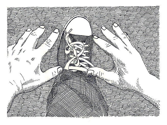
Illustration for: I Don’t Believe You, by Boy and Guitar (link)
Brian Raiter
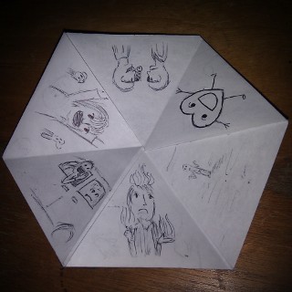
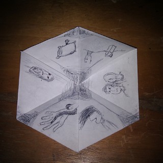
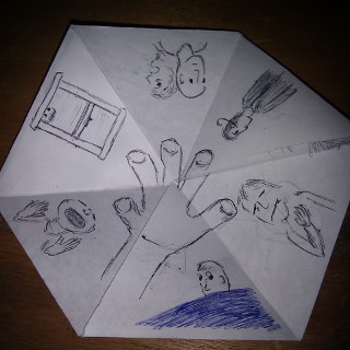
Hexaflexagon for: Fingertips, by They Might Be Giants


I think this is the first time I’ve created something for the Commuter Challenge that can’t easily be captured digitally and placed in a web page. In the bottom picture I tried to give some idea of how a hexaflexagon works. A hexaflexagon is a strip of paper folded into a hexagon shape which can unfold to display three different sides. As you flex the thing and display the different sides, the triangles that make up each side get rotated with respect to each other. (Typically one decorates a hexaflexagon with symmetrical patterns that become different patterns when flexed.) The shifting around of the images reminded me of how the CD encourages listeners to play “Apollo 18” on shuffle, so that the various parts of Fingertips get interleaved at random. For the final segment, “Darkened Corridors”, I placed the illustration in the center of the 2nd face, but I also added a second illustration, so that the corridor is still in the middle when the face is flexed into its other configuration.
by Brian — 1 June 2014 @ 01:30
Brian’s hexaflexagon: My mind is blown.
by RyanF — 1 July 2014 @ 20:31
I have slowly been trying to improve my drawing skill, and after skimming a bunch of YouTube videos on the subject one common piece of advice really appealed to me – almost everyone said that it is good practice to copy art that you like. I had done something like that with Gustave Dore when I was so heavily into linoleum cuts, and I think the advice makes sense. But I’ve never had a lot of patience with my sub-par drawing skills; it is frustrating to me when something I draw doesn’t turn out as good as I want it to, and that is what happens most of the time.
Anyway, I decided to start copying some of Edward Gorey’s works, and to do some original drawings in his style. I’m still very fond of Brian’s October 2007 CC homage, and thought I’d try my hand at it. I quickly found out how difficult it is to try to emulate Gorey. He took few (if any) shortcuts and seemed to prefer more complicated efforts. For example, if I were to draw a paned window, I would probably give it 4 or 8 panes to make it easy to block out, but Gorey seems to have preferred aggravating multiples of 3. And while trying to figure out how Gorey did some of his more intricate crosshatch shading, at one point I’d convinced myself that he must have used some sort of inked cheesecloth, but no, he carefully drew each line when most people would probably opt to scribble the darker shading onto the page.
My submission is obvioulsy not really in the style of Gorey. Gorey almost never did any closeups. Almost all of his drawings put the viewer a comfortable distance from the subject(s), with a view of each character’s full form and surroundings. My drawing is mostly crosshatching practice. When I look at it now, I think I should have kept adding lines.
“I Don’t Believe You” by Boy and Guitar is a quirky little song that I have been listening to and enjoying since it lost SongFight sometime in 2003. It didn’t even make the top 5 out of 17 entries, but it was by far my favorite. There is even a music video for the song out there somewhere.
by RyanF — 1 July 2014 @ 21:19
p.s. Thanks again to my talented and patient hand model Andrei.
by RyanF — 17 July 2014 @ 13:38