The April 2012 Challenge
We will be returning to illustration in April. The challenge is to create a image which is centered around a chessboard. The chessboard and its pieces can be the whole of the illustration, or it can just function as the image’s focal point. But it must play a central role in the image. There are no further requirements as to the contents or the purpose of the image. Render your favorite moment from 1999’s Kasparov vs. Toplov, or use this opportunity to present your own idea for a chess set.
If you’re really feeling the need for a challenge, forgo the 2-D requirement and create your own chess pieces, in which case you can earn bonus points for sending your prototype to the Franklin Mint for consideration.


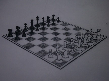
This is one of the least interesting CC entries I’ve submitted. I used this month an excuse to produce a simple study exercise. I used a photograph as a model, which accounts for the relative accuracy, but even so you can see e.g. that the two black bishops are quite unmatched with each other. My skills have definitely improved over the years, but still have a long way to go. On top of which, various events at the end of the month conspired to prevent me from getting my meager entry properly scanned before month’s end. Thus the above is a photo taken with a smartphone.
(Actually I lied; my entry was not merely a study exercise, but actually part of a larger project I was working on this month. If you’re curious, http://www.muppetlabs.com/~breadbox/sketch/ has more details.)
THANK GOD Ryan Finholm’s entry awesomeness more than makes up for mine. So cool. I have no words, other than to acknowledge that, like war, chess is hell.
by Brian — 1 May 2012 @ 01:23
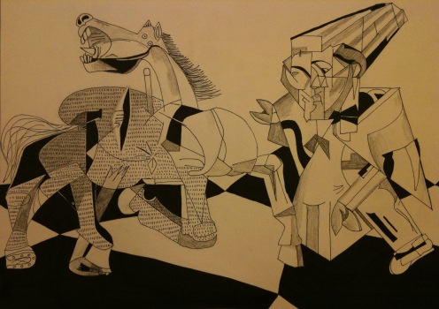
This ‘Bishop vs. Knight’ drawing started out as a much larger project on watercolor canvas, but that just didn’t work. It was my first experience with watercolor canvas, which just wouldn’t hold the paint the way that paper does. After a couple of weeks of going at it, taking a break for a few days, and then rinsing paint off to try different approaches, I ended up scrapping it and going back to paper. By that time is was late in the month and I realized that I wouldn’t have time to finish painting, so I changed direction and ended up with ink and pencil on paper – that way I was able to take it with me and work on it while traveling. Much of the drawing was done at a Marriott in Raleigh, North Carolina. I completed the drawing on the due date, and the finished product was photographed in the hotel room’s bathroom (because that was where the light was brightest). So it was a true Commuter Challenge for me.
The horse is taken from Picasso’s Guernica (of course). The bishop is a sort of combination/interpretation of Hugo Ball’s magic bishop costume and one of Diego Rivera’s cubist portraits. I enjoy and appreciate Rivera’s work, and he had his own style and genius, but doing the two cubist figures side-by-side and one right after the other, it was obvious to me that Picasso really had the cubist spark while Rivera was probably just taking a stab at the style. Not that my interpretation does Rivera any justice.
With more time I would have done something with all that empty white space at the top, and I would have added color. But considering the time constraints I ended up with, I’m okay with the result.
Brian’s entry looks quite basic at first glance, but that is somewhat deceptive. The perspective is just right, and that had to have been very difficult to pull off with 32 separate elements with differing heights spread out throughout the image. I am surprised that he didn’t submit something more fanciful, but I am envious and impressed by the skill behind his drawing.
by RyanF — 6 May 2012 @ 10:57