The July 2011 Challenge
Create a design for the face of a clock or wristwatch. You may choose to submit a purely decorative design for a traditional clock face, or you might want to envision a complex mechanical design … or perhaps an innovative new visual representation of the passage of time.
The Results
Ryan Finholm

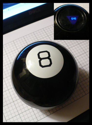
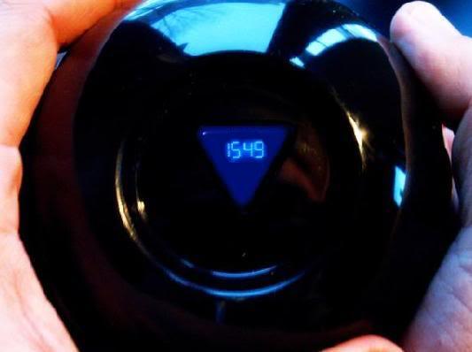
My submission for the July 2011 is a Magic 8 Ball Clock. I envision it working almost exactly like a regular Magic 8 Ball, with the addition of a blue digital LED clock as the message that would appear most often, with the occasional alternate message appearing instead.
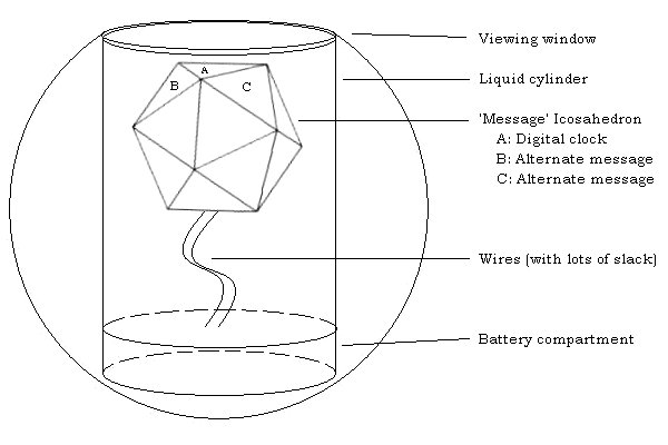
Inside the Magic 8 Ball is a watertight cylinder that contains a white icosahedron floating in dark blue liquid. In the normal Magic 8 ball, each of the 20 faces of the icosahedron has a statement printed on it in raised letters. There is a transparent window on the bottom of the Magic 8 Ball through which these messages can be read.

The “Magic 8 Ball Clock” would have an digital LED clock as one of the faces. The other significant design change for the clock would be the addition of a squat chamber for replaceable batteries. Adding the battery chamber also creates the need for wires attaching the formerly free-floating icosahedron to the battery pack. The wires would actually improve the utility of the clock: the slack wires running from the battery pack to the side of the icosahedron diametrically opposite to the clock face would mildly weight/anchor the device to favor the clock face to appear in the window. Depending upon the slackness of the wires, either three or nine other faces of the icosahedron could have the potential to appear in the window, and alternate messages would be added to those faces in raised letters – messages like “TOO EARLY”, “TOO LATE”, “HAPPY HOUR”, “TIME IS AN ILLUSION”, etc. More than nine other faces would probably cause problems with tangling and/or stress on the wires, and might lessen the frequency of the clock face appearing (which would be less desirable, since the assumed primary function of this device is to be a functioning clock).
The side of the Magic 8 Ball opposite the viewing window is traditionally the black 8 printed on a white circle. The best place for the battery compartment would be that area; it would be easiest to conceal it if the removeable lid was the white circle, with its tight seam along the white circle’s circumference.

Potential problems with the clock:
- The wires would have to be extremely flexible, like string or thread rather than typical metal wire. This might be difficult to arrange, because the wires will also have to be well insulated from each other and from the blue liquid.
- Since the whole point is to have the wires moving flexibly, the wires would have to resist the weakening, cracking or fraying that usually follows the repeated bending of wires.
- The cylinder would have to be sealed very carefully, and retain that seal, to prevent liquid from leaking into the battery compartment. This might be especially difficult given the wiring required.
- Yet another set of wires would be needed so that the time could be set or re-set whenever needed (time zone differences, daylight savings time, battery replacement, etc).
Brian Raiter
(Link.) This clock uses a nonstandard ordering of the numbers on its face, but otherwise works just like a normal clock. That is to say, the minute takes five minutes to travel from one number to the next. Likewise, the hour hands follows the same path, only slower. The challenge is therefore not only does one need to familiarize oneself with the layout of the numbers on this clock face in order to correctly read the time, but also the current velocity of the hands has to be taken into account. Of course, in practice one cannot visually gauge the speed of the hour hand’s motion over a short time span, so it helps to have a rough idea of the current time when reading this clock face. Nonetheless, I think with practice one could eventually develop the skill.
Note that the button in the bottom left corner will add a second hand to the display. I feel that the clock looks better without a second hand, but watching the sweep of the second hand definitely helps one get a feel for the motion of the other hands.
(Link.) Unlike my first submission, this is just a standard clock with a non-standard labeling of the twelve points. It refers to the famous four-fours mathematical brain teaser. Unfortunately, this produced a pretty crowded design. (And depending on your browser and its font settings, it might look even worse.) I think it would be tricky to make this design look attractive and still be legible from a distance.
Again, the button in the bottom left corner will display the clock’s second hand.
This challenge gave me a good excuse to try my hand at SVG programming, something I’ve wanted to do for a while. I had a lot of fun putting together my submissions. I never figured out a reliable way to position the text elements, though, so a badly chosen font on the part of the browser could really ruin the appearance of my clock faces.
I actually had the idea for the four-fours clock first. I didn’t keep it for my main submission because I suspect that I’ve actually seen it before, and my subconscious brain just pretended that it was an original idea when it handed it over. If so, I hope the original makers did a better job of balancing out the labels. That big chunk of white space around 9 o’clock looks awful.
by Brian — 1 August 2011 @ 03:42
Damn this cursed internet. There are no new ideas. My original thought for this challenge was to design an indoor sundial, with two spotlights at different heights rotating around a fixed post – the shadows would be the hour and minute hands. Thinking back on my July 2008 CC card game debacle, I checked the internet to see if someone else had done it first. Sure enough, there are at least two designs out there that are similar to my idea, and one in particular (which can be seen at ironicsans(dot)com/2008/03/idea_the_bulbdial_clock(dot)html) is much more elegant than my vision of it. Not only that, but some other geeks actually made a working model of one at evilmadscientist(dot)com.
If you do an image search using keywords like “unique clock” or “strange clock”, you come up with dozens and dozens of really interesting designs. One that really knocked me out was the fan clock at creativehomelife(dot)com/fan-clock(dot)html. I wish I’d thought of that.
The only real virtue of my design is that, to the best of my knowledge, nobody had thought of it before. The technical issues would make it too much of a hassle to produce anyway, but I do sort of like the idea of a LED time readout slowly appearing out of the blue liquid maybe two out of every three shakes.
Brian’s ‘nonstandard’ clock freaks me out. The longer I watch it and try to figure it out, the stupider I feel, and there is some inherent value in that.
by RyanF — 16 August 2011 @ 02:32